For organizations that are running their operations online, as a modern-day player in the market, it is quite relevant for them to own a web form space over their website. These forms meet distinctive purposes from time-to-time and are quite helpful in storing data from users.
However, if you one of these business owners and still have not got a website form up and running, you surely are lacking behind. And to prove you that, let’s understand what are the most important do’s and don’ts of designing the perfect website form.
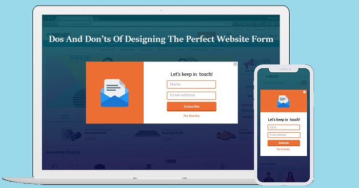
Firstly, to clear the midst of confusion, do you know what exactly a website form is?
This template can be embedded into the codes of your website using multiple frameworks—PHP or HTML, etc. The fundamental purpose of such forms is to gather the data from the visitor.
He or she can be the ultimate buyer, clients, customers, or any other stakeholder who is showing a keen interest in your website and product offerings. What these forms do is give every visitor a chance to connect with you.
These forms can be for timely feedback, filling up the contact information, signing up to a perfect newsletter, and so on. As we said, it meets different purposes.
But the defining model of designing the perfect website form is that users should be able to understand what is being asked. Moreover, these forms should also meet the immediate need of information put forward by the user as he or she fills up the form.
Now we suppose a detailed explanation has been given about the website form. So, let’s move forward to the Do’s and Don’ts. Once you are familiar with these two aspects of designing the perfect website form, your sales will shoot up, customers will order in bulk, and clients will be happy to work together with your team.

Table of Contents
Do’s
1. Know Where Exactly To Display The Website Form
Majority of the times, a website has a poor design of the form. In fact, users are not able to find the form itself. So, to avoid such mishaps, you need to know where to put up a specific form.
Like the feedback or review forms should be embedded on the product’s page. A few spaces below the product, users must be able to see the reviews left by other users. And just beside that, you need to open a CTA option for existing buyers to fill up a feedback or review form.
Similarly, in case of a subscription or a newsletter form—display it on the main page of your website. You can even have a screen popup, inviting a user to sign up for the latest updates and news as soon as the visitor click the main link of your website.
Whereas, for a contact information form—generally it is embedded in the Contact Us section of the website. It is almost immediately placed next to the About Us section.Because of these two sections adjacent to each other, users will find it pretty convenient to reach to you with full information about the offerings that you provide.
2. Proofread The Language Of The Form Before Finally Publishing It Into The Website
Create contact forms for your WordPress site consists of multiple stages, one of them being the proofreading part. You need to stay away from or remove the errors. For that to happen, you need to recheck the content at least twice before finalizing it.
a) Check whether the questions are rightly written.
b) Check for any data validation formulas that might be embedded, hampering the input of the data from the user’s end.
c) Check if the text size is readable.
d) Check whether the CTA options are placed at the end of the form. Putting it above, at the right or left side is a big turn off for the customers.
Don’ts
1. Stay Away From Lengthy Details
Asking too many questions at once can be intrusive for the user who doesn’t even know you first-hand. Experts suggest that asking minimal contact information at the starting is quite sufficient.
If you keep on soliciting each and every detail, it gets time-consuming and irritates the user who has to fill everything. In such cases, either the user switches the website or fills the information completely wrong, which is even worse. If you ask why, here’s the answer:
a) Analysts would not be able to infer correct details.
b) Marketing strategies will target the wrong customers.
c) Business owners will end up taking the misguided decisions.
d) And eventually, the profit margins will suffer.
All this happens when the wrong information is put in. Therefore, from the beginning, make it a habit not to intrude into the privacy of the customers. Once they have given contact information—email/links/contact number, you can pitch them your ideas accordingly.
But, asking everything from a stranger at the first point of contact is the worst strategy till date. So, try to avoid it, unless it is extremely necessary for legal or related purposes.
2. Avoid Using Captcha
This might sound whimsical at first glance, but it’s true.Designing a perfect website form should be focused on helping the users contact you in any which way. Unnecessary Captcha inputs only turn off the targeted customer. And once that happens, it would not take him or her much time to switch over the next best website.
3. Missing The Tests To Run For Successful Forms
Before users finally use the forms, you need to go through proper testing for the website forms. For example, A/B testing helps to identify the integrity of the field length, size, style, colors, and other features.
Otherwise, there are other tests available suiting the versatile needs to verify the website form.Check out the questions below while drawing a perfect test:
a) Is your website form compatible with different browsers, countries, regions?
b) Can it be loaded swiftly through other mobile devices, irrespective of the model?
c) Is the desired testing under your budget?
There are so many questions that are needed to be answered. But we suggest you to at least go through one or two testing sessions before making a final call for a website form.